 Tersby
Three views of the page
The switch at the top shows the page on a desktop, a tablet and a phone. Most ad visitors come from phones, so check the phone view before every publish.
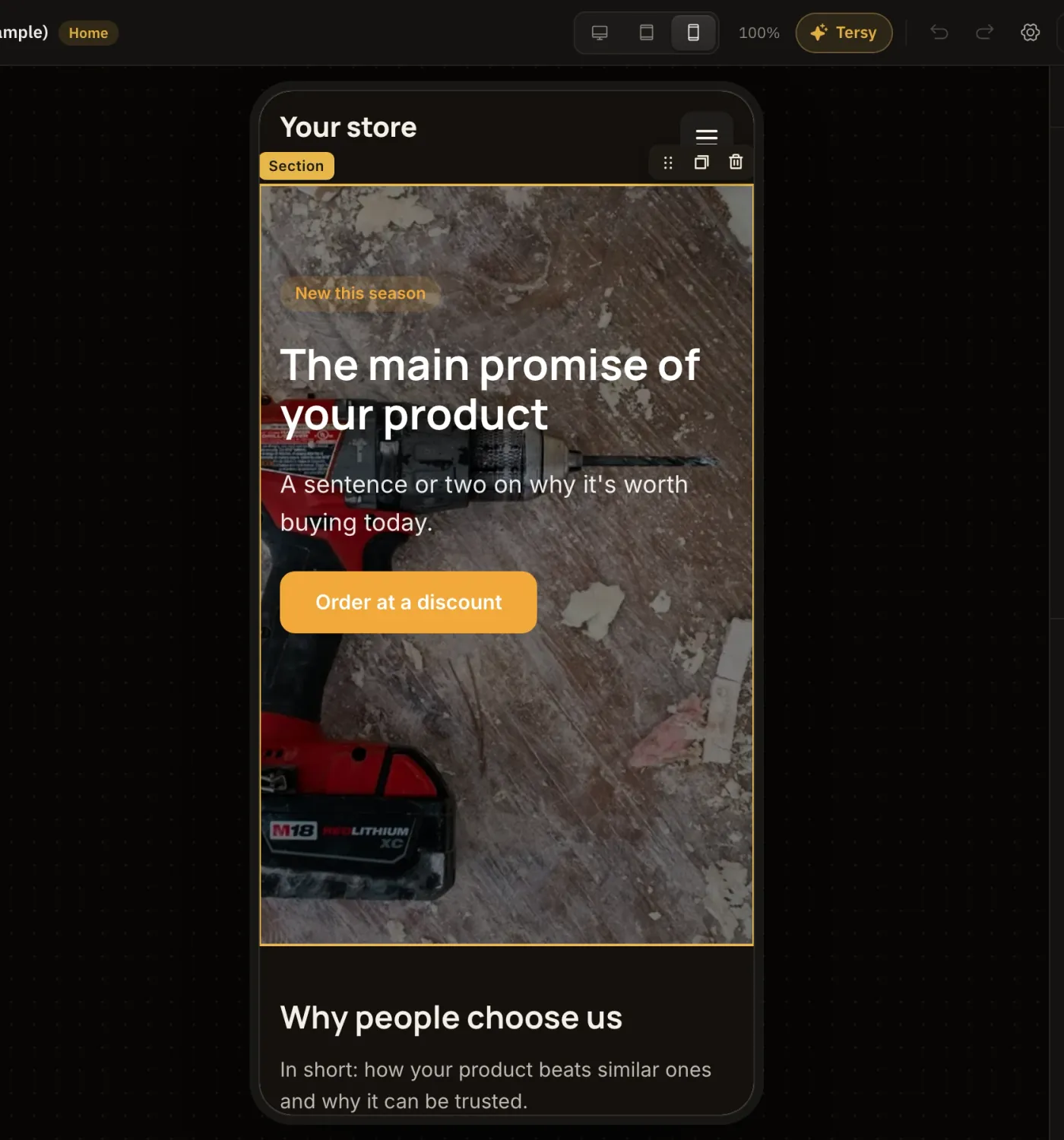
What adapts by itself
- Columns stack under each other.
- Big headings get smaller.
- The header's menu goes under a burger button.
- Galleries, plans and team rearrange into one or two columns.
- The free section lays out its elements separately for each screen (see «Free section»).
Edits for one device only
Pick «Tablet» or «Phone» and change sizes, spacing, font, alignment. Such edits apply on that device only: the desktop stays as it was. The ↺ button next to a field resets it, and the device takes the shared value again.
The order is desktop → tablet → phone. A phone without its own settings takes the tablet's, the tablet takes the desktop's.
Texts, pictures and links are shared by all devices: edit them on any screen and they change everywhere.
Hide on a device
Any element or section has a «Visibility» group: hide on desktop, tablet or phone. For example, keep a long table on desktops only and show a short list on phones.